HCI Assignment 2
A
A.1
A user illusion is the illusion, that a user interface is more than e.g. just pixels. The experience a user has when using an interactive system is different for each person because it depends on the users mental model. The mental model is the users subjective model of a system. User illusions can be created by e.g. using design metaphors.
A.2
The perfect illusion (which can’t be achieved 100%) would be that the user actually thinks they are at a real concert. However, with good design you can make it very immersive. A really important element of a virtual concert would be the sound. It must be spacial (3D) and high in quality, on top of that the system should ask the users to use headphones. VR support is would also make it a lot more immersive. If the user doesn’t have a VR headset, the system should also ask the user to dim the lights of the room they’re in. Design metaphors also make it more immersive: Instead of having a button called “shop” where you can buy drinks, the button should look like a bar/wallet and when you click on it the menu looks like a bar where you can drag drinks off to buy them.
B
B.1
The stereo belt is a two in one object, it is a belt and a walkman in one piece. Therefore, the stereo belt may be a good piece of technology for workers who don’t want to carry any extra objects with them. The problem is, however, that you can’t use it if you don’t wear pants that support a belt. Therefore the stereo belt is more efficient but less flexible than the normal walkman. A walkman also looks less threatening and simpler, therefore it’s better in terms of learnability. The easy learnability as well as high flexibility of the walkman were it’s strengths, paired with a lot of advertising to make it likeable are probably the reasons why it became popular.
B.2
The human centered design process is, as the name suggests, all about the human. The first step when designing a new system should be to understand the users, their tasks and the context of use. After that you should plan a conceptual model and build a prototype version on top of it, which then gets evaluated by the users. These steps should be repeated until the user based feedback is good enough, then the system can be realized technically.
C
C.1
Both the mental and the conceptual model are subjective views of the system model, which is a high-level description of how a System is organized, implemented and operates. The mental model is the view of the system model that a user has when using a system. The conceptual model is the view of the system model a designer has when designing a system.
C.2
Generation Z: “Paying wireless by card works by using my phone or watch, which has a nfc chip built into it. Credit cards are mostly virtual and not an actual physical card, but to pay online I use a different service when possible (e.g. Paypal)”
Boomer: “Some cards support wireless payments, but not all cards do. Cards are physically stored in a real wallet and typically used to buy things online, too.”
Grandma-Generation: “Hasn’t a credit card always worked without a wire?”
D
D.1
Baby:
- uses the TV passively
- doesn’t really know it can interact with the TV
- sometimes tries to interact with it in mostly unexpected ways
Teen
- uses the “smart” functions of the TV the most
- installs apps on the TV like for example Netflix
- doesn’t just watch movies/shows but also listens to music
- sometimes plays games
- helps the other family members when they have a problem with the TV
Parents:
- typically watch normal, live TV program
- sometimes record shows to watch them later on
- on extremely rare occasions they dare entering the ARD-Mediathek to watch an episode of “Tatort” they missed to record
D.2
- Show normal live TV program
- Navigate through menus/channels
- Show video on demand
- Play games
- Play music
D.3
| Task/Persona | Baby | Teen | Parents |
|---|---|---|---|
| normal live TV | 0.5 | 0.2 | 0.6 |
| navigate menus/channels | 0.001 | 0.2 | 0.1 |
| video on demand | 0.4 | 0.4 | 0.2 |
| games | 0 | 0.1 | 0 |
| music | 0.099 | 0.1 | 0.1 |
E
E.1
Description errors are errors, during which a user confuses an action with a different one. A good interface would be designed in a way, so that each UI element is clearly distinguishable from another. Their perceived affordances should also match their actual affordances.
E.2
-1-2.jpg)
First design:
- Alarm: On press sets/unsets alarm, also shows time of alarm while pressing
- +Hour: Increments hour of displayed time by 1 (press alarm and +hour to change alarm time)
- +Minute: Increments minute of displayed time by 1
- Snooze: snooze
Second design:
- Alarm bell: On press sets/unsets alarm
- +Hour: Increments hour of upper display time by 1 (press alarm and +hour to change alarm time)
- +Minute: Increments minute of upper display time by 1
- Switch: Switches time on upper display with the time on the bottom display
- Snooze: snooze
Pros & Cons:
Both are similar in design, but the first design is simpler. That means its easier to understand and easier to manufacture (1 display only, less buttons). However, users can’t see the time the alarm is set for just by looking at the display. The second design also allows to have two different times which you can swap whenever you like. This function can be used independently from the alarm function.
F
F.1
UI guidelines are definitions of how the user interface should:
- look like
- be operated
- react
- feel
Usability principles on the other hand are fundamental truths or propositions about design. One such example are the design principles by Gould and Lewis.
F.2
Apple watch button:
depending on the model 42-44mm

Win10 checkbox/switch Switches should be specifically used when users makes choices that instantly take effect on switching the switch (e.g. light → dark mode) Checkboxes on the contrary should be used for optional, multi step decisions. ![[CleanShot 2021-05-09 at 16.17.15@2x.png]]
Android material design Most important: Simplicity. Radius: 20% of icon size: ![[CleanShot 2021-05-09 at 16.21.23@2x.png]] Key shapes, different types: ![[CleanShot 2021-05-09 at 16.22.07@2x.png]]
G
G.1
Microphone holder
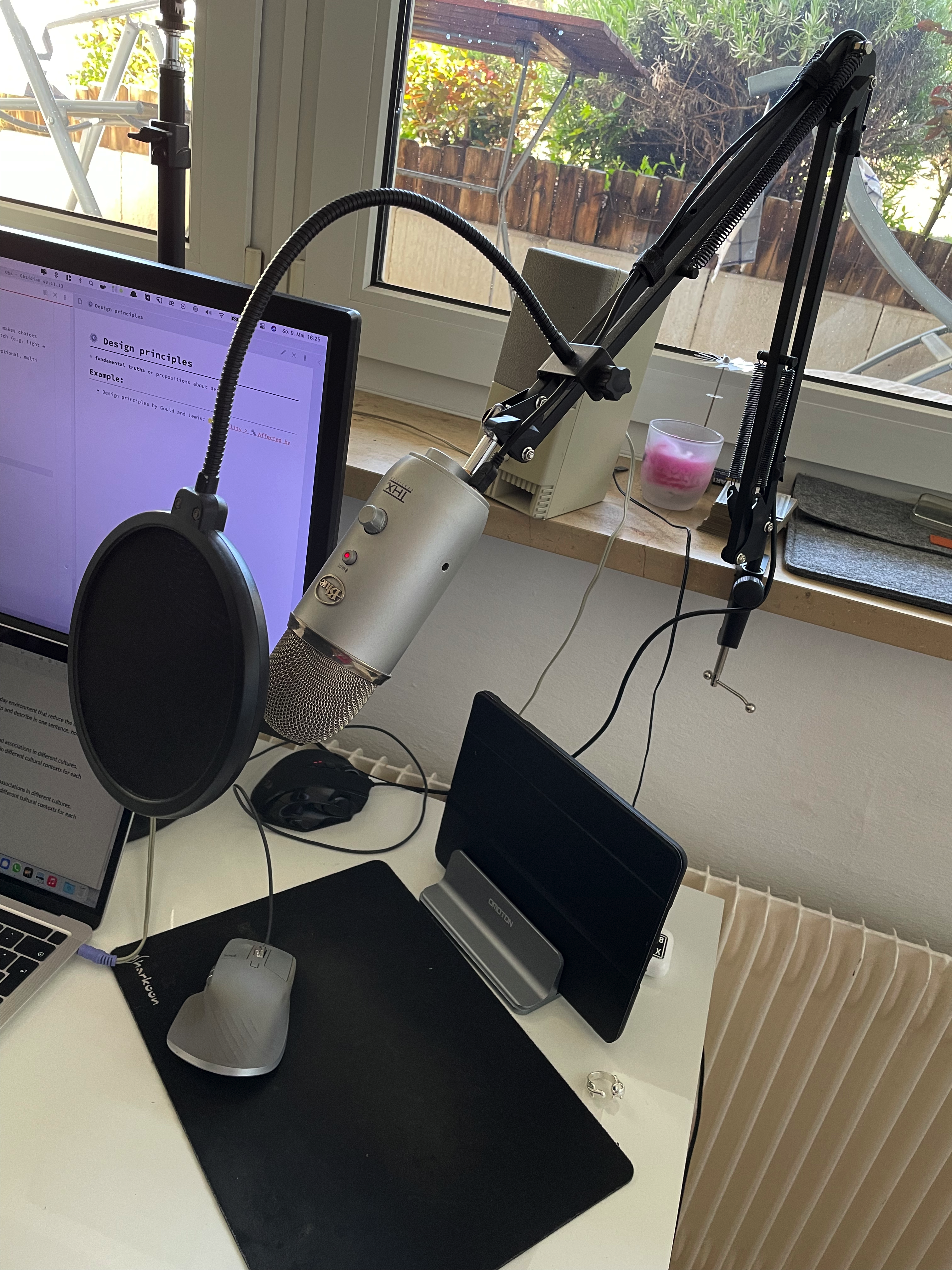 Only allows for 2-dimensional movement of the microphone (forward/back and up/down), also holds it in place.
Wireless charger
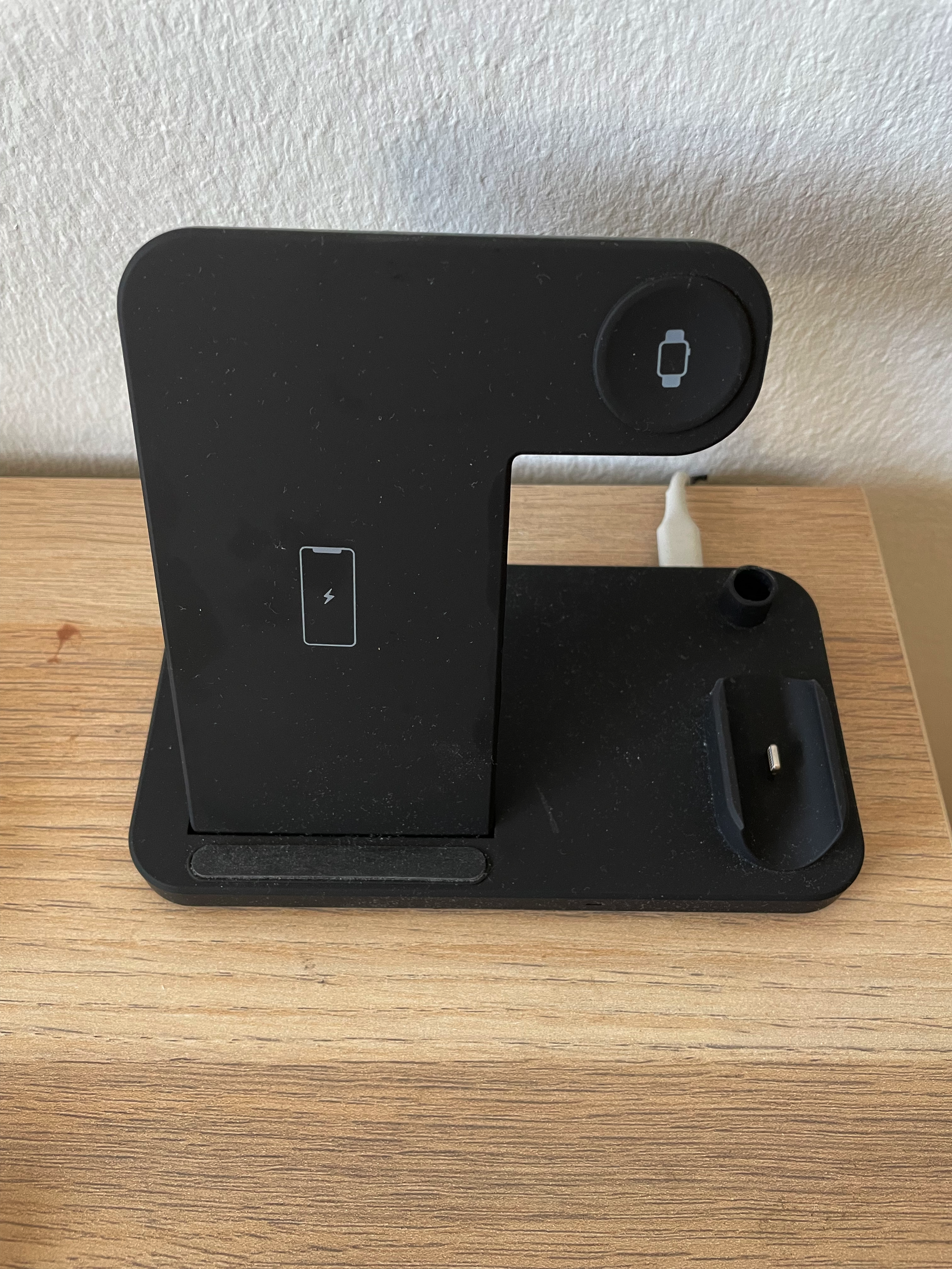 Can’t plug in the charging cable the wrong way.
G.2
🔴 Red: Can be seen as either the color of love/passion or violence/blood
🟡 Yellow In Japan, yellow represents courage. In India on the other hand, it is a color for merchants
Source:
G.3
👌 In most countries the 👌 sign means okay but in some countries such as Brazil it is an offensive gesture
👍 In most countries the 👍 sign means “good”. In Iraq and Iran, however, it’s equivalent to “Step up your game”
Source:
https://brightside.me/wonder-places/15-hand-gestures-that-have-different-meanings-overseas-769110/